March 1, 2023
New Updates on NFT Feeder
Improved interface, collection health, rankings table, and more!

NFT Feeder updates
Nftfeeder.io has released new features to improve user experience, including a better interface, faster loading times, a statistics function, and a rankings system. The platform has become popular and is set to grow with these updates.
Collection Health Board
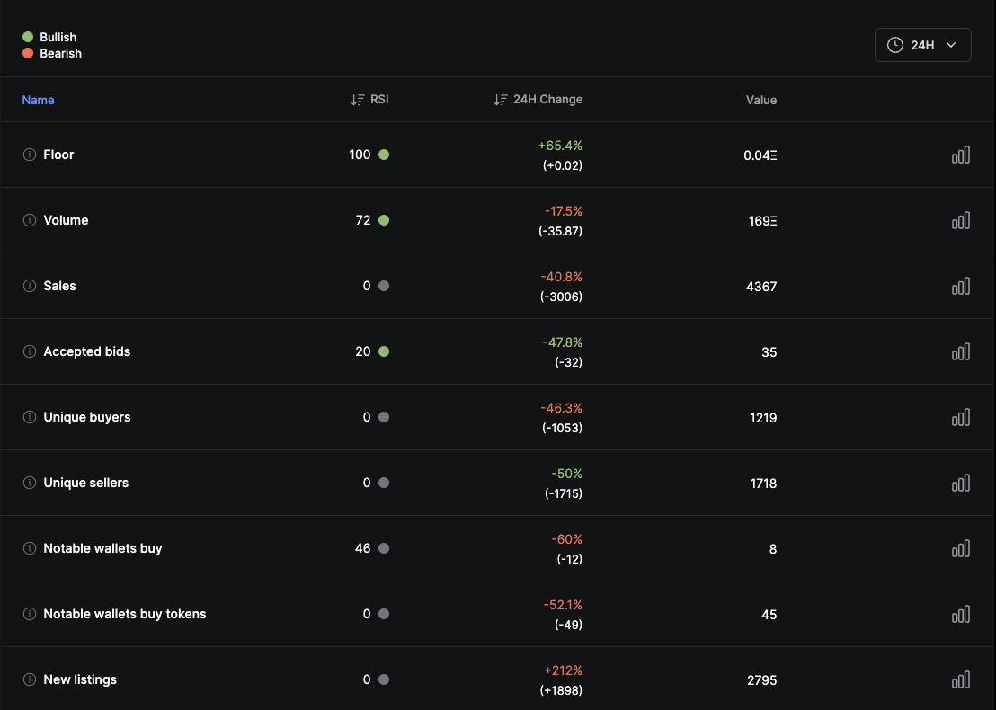
The new “Collection Health Board” tool provides a focused view of collection statistics and can be found under the “Charts” tab. The dataset includes 28 data points, filtered by time, with each point having a name, RSI, 24-hour or 1-hour change, and current value.

RSI Indicator
The RSI is color-coded to indicate bullish or bearish trends, and users can sort data by RSI or change by clicking on the table header. By default, the dataset is sorted by group, but users can easily change the sorting to suit their preferences.
Multiple Charts
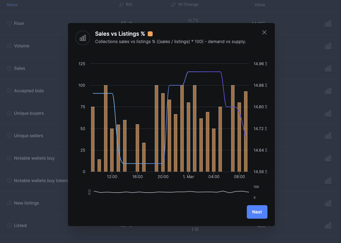
Looking at the “Azuki” we see that there are a lot of green and red dots. Clicking on the first row opens a popup with floor value over time, and a little chart showing RSI over time. Clicking next shows similar events, giving a quick overview of the collection’s health.

Rankings Table
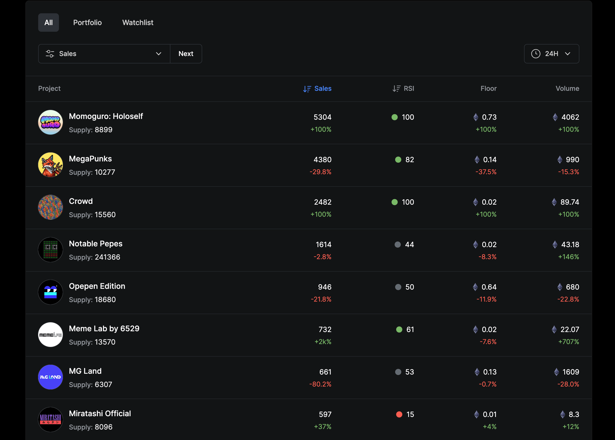
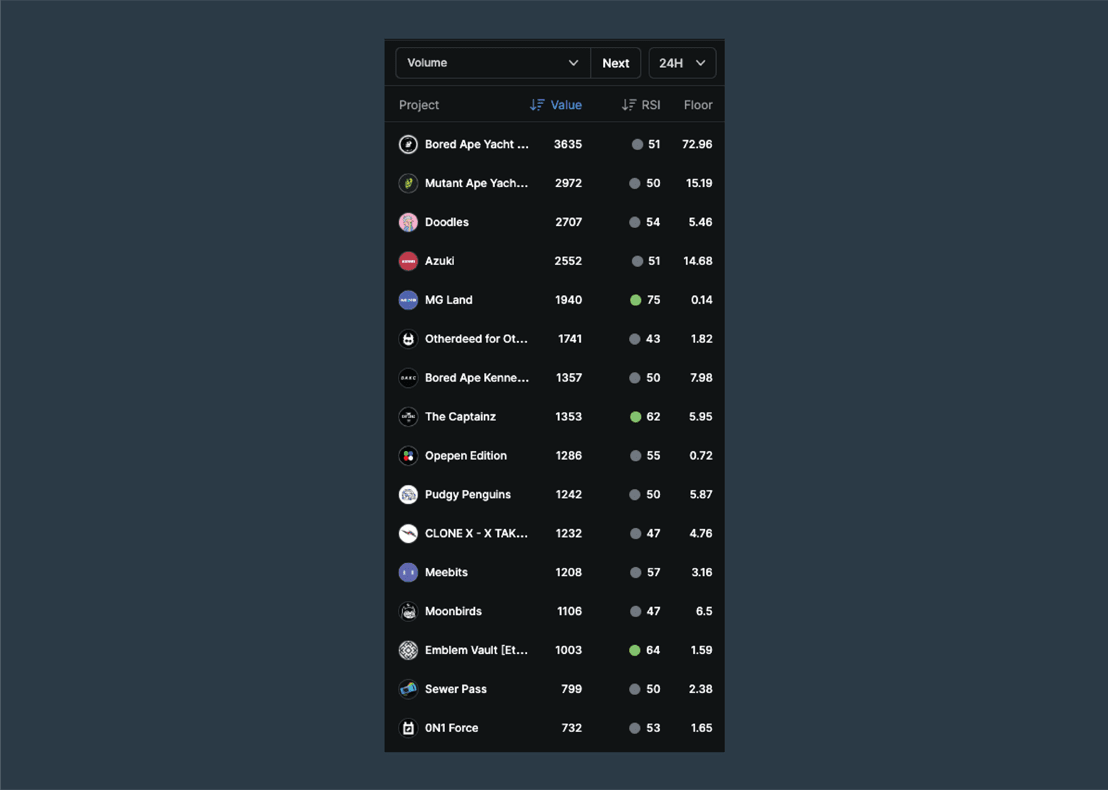
The new “Rankings Table” is accessible by clicking the rankings icon on the right sidebar. Users can adjust settings to filter out spam, view All, Portfolio, or Watchlist, and use familiar filters found in the profile view. The table can be sorted by Value and RSI.

Collection view
Clicking on “collection” provides a better understanding of what is happening. These features allow us to easily identify and understand collection current state. NFT Feeder plans to expand these features in the future by adding more statistics. Happy collecting!